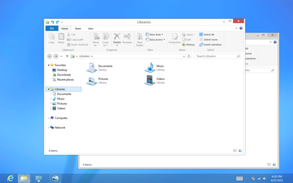
Many users pointed out that the classical Aero desktop didn’t blend with the Metro start screen, a “fact” that apparently Microsoft has started to take notice. So last Saturday, over at the Building Windows 8 blog, Microsoft engineers wrote a 10,000 worded post describing why they decided to move away from the Aero desktop, an interface that became wildly popular when it made its appearance in Windows Vista.
We spent a lot of energy carefully considering how substantially to update the appearance of the desktop in Windows 8. We looked at many, many pictures, and considered hundreds of designs. … In the end, we decided to bring the desktop closer to the Metro aesthetic, while preserving the compatibility afforded by not changing the size of window chrome, controls, or system UI. We have moved beyond Aero Glass—flattening surfaces, removing reflections, and scaling back distracting gradients.
We applied the principles of “clean and crisp” when updating window and taskbar chrome. Gone are the glass and reflections. We squared off the edges of windows and the taskbar. We removed all the glows and gradients found on buttons within the chrome. We made the appearance of windows crisper by removing unnecessary shadows and transparency. The default window chrome is white, creating an airy and premium look. The taskbar continues to blend into the desktop wallpaper, but appears less complicated overall.
To complete the story, we updated the appearance of most common controls, such as buttons, check boxes, sliders, and the Ribbon. We squared off the rounded edges, cleaned away gradients, and flattened the control backgrounds to align with our chrome changes. We also tweaked the colors to make them feel more modern and neutral.

However, as Paul Thurrott points out, the reasons Microsoft puts forward in support for the removal of Aero isn’t convincing, but rather full of hypocrisy. Paul notes that while the Aero glass border is gone the rest of the UI retains the old look which still has a lot of chrome and visual cacophony Microsoft talks about getting rid of.
On the other hand, removing Aero will sure have a positive effect on laptop’s battery life. Although Aero glass looks nice it drains the battery. Users had the option to turn Aero off, but the alternative – Aero Basic, is ugly. The new Metro explorer looks comparatively better.
These changes will not be included in the coming Release Preview. You can hope to see them all in the final release of Windows 8.

Comments
Post a Comment