Update: 3D Maps are now built-in in Excel 2016.
Microsoft has released a new 3D visualization tool for Excel that allows people to plot geographic and temporal data on a virtual globe and create interactive guided tours to share with others. The new tool, called GeoFlow, is available as a plugin for Excel 2013 and can be downloaded from the company’s website.
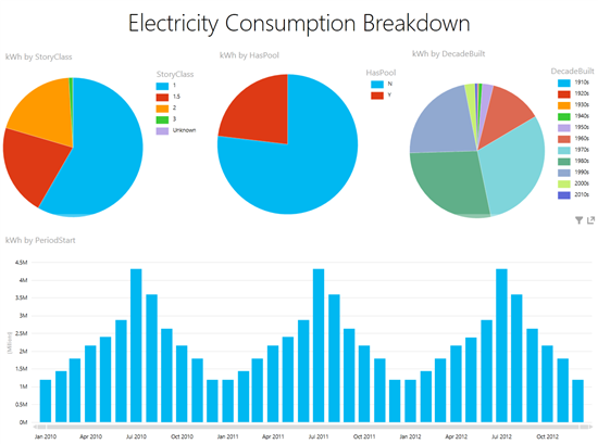
GeoFlow allows users to visualize how time-sensitive geospatial data change over time. As a demonstration, Microsoft used a simulation of data of monthly power consumption of households in the Dallas, Texas area. A typical Power View presentation of the data, visualized through predefined reports that are built up within the Excel workbook, including bubble charts, pie charts, maps, line charts, and column charts would look like this.

For the GeoFlow Preview presentation, additional data about households were mapped using longitude and latitude. From the Excel blog:
Columns were presented on these points illustrating square footage or market value of the properties. The decade of the construction of the homes was used to highlight the various neighborhoods. A second layer was added to the presentation to show household kWh consumption as a heat map. This data leveraged the Play option in GeoFlow Preview in order to show how the map of kWh consumption changes over time: The first day of each month was embedded in the PowerPivot data set since the Play option requires a date value so that the customer could see the ebb and flow of energy consumption over the three-year period. Various neighborhoods were zoomed into to illustrate differences in consumption patterns between them.
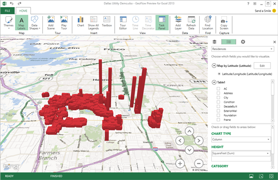
The final GeoFlow visualization looks like this. This visualization shows house locations and the height of the columns shows their size.

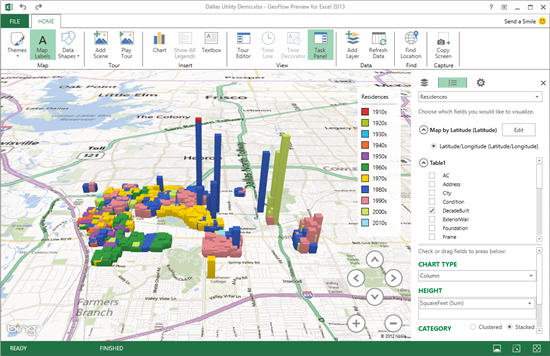
Another visualization shows houses color coded by the decade in which they were built.

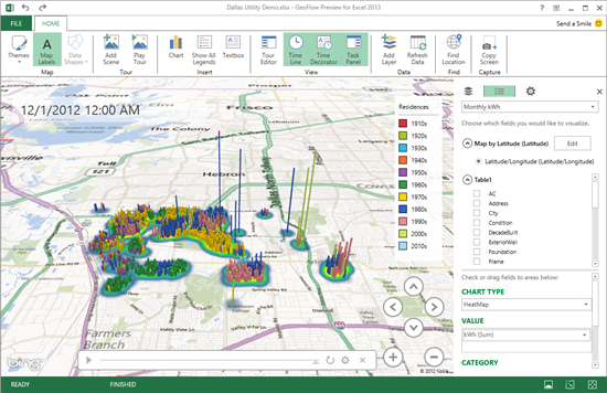
The one below is superimposed on a heatmap of energy consumption in the area.

The entire visualization can then be packaged into a guided tour, that can be shared with other GeoFlow users.

Comments
Post a Comment