Timelapse Using Earth’s Satellite Imagery

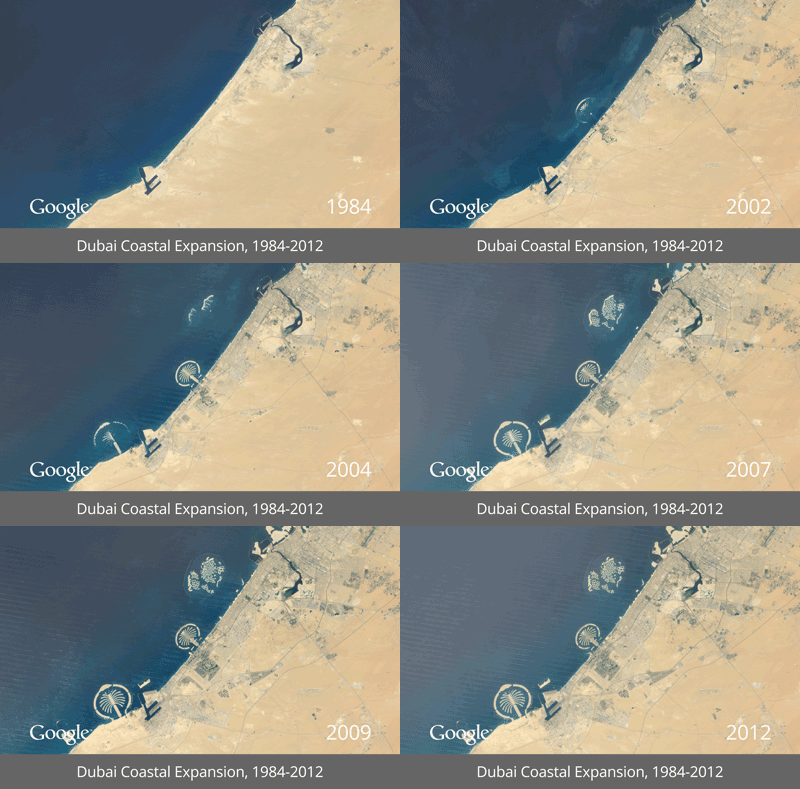
Google Earth, in collaboration with the U.S. Geological Survey (USGS), NASA and TIME, has unveiled a new project called Timelapse that lets you visualize how different parts of the earth have changed during the past 28 years. Using high resolution satellite imagery of the Earth, Google has created an interactive, time-lapse animation that progress year-by-year, showing exactly how the Earth’s surface has changed in key areas like the Amazon Rain Forest, booming metropolitan areas of Las Vegas and Dubai, and the sad disappearance of water bodies like the Aral Sea.

The images were collected as part of an ongoing joint mission between the USGS and NASA called Landsat. Their satellites have been observing earth from space since the 1970s sending images back to Earth where they were archived at USGS. Google joined in in 2009, to make this historic archive of earth imagery available online.
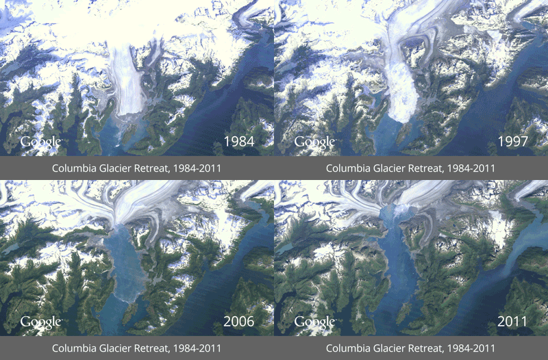
Columbia Glacier Retreat

Dubai Coastal Expansion

Using Google Earth Engine technology, they sifted through 2,068,467 images totaling 909 terabytes of data to find the highest-quality images, like those without clouds, for every year since 1984 and for every spot on Earth. They then compiled these into enormous planetary images, 1.78 terapixels each, one for each year.

Then with the help of CREATE Lab at Carnegie Mellon University, they converted these annual Earth images into a seamless, browsable HTML5 animation which you can check out at the Timelapse website. You can pause the animation and zoom into the image to get a better look, or move the slider forward or back at your own pace.

[via Google Latlong blog]

Comments

Popular posts from this blog

How to Record CPU and Memory Usage Over Time in Windows?

Whenever the computer is lagging or some application is taking too long to respond, we usually fire up task manager and look under the Performance tab or under Processes to check on processor utilization or the amount of free memory available. The task manager is ideal for real-time analysis of CPU and memory utilization. It even displays a short history of CPU utilization in the form of a graph. You get a small time-window, about 30 seconds or so, depending on how large the viewing area is.

How to Schedule Changes to Your Facebook Page Cover Photo

Facebook’s current layout, the so called Timeline, features a prominent, large cover photo that some people are using in a lot of different creative ways. Timeline is also available for Facebook Pages that people can use to promote their website or business or event. Although you can change the cover photo as often as you like, it’s meant to be static – something which you design and leave it for at least a few weeks or months like a redesigned website. However, there are times when you may want to change the cover photo frequently and periodically to match event dates or some special promotion that you are running or plan to run. So, here is how you can do that.

Diagram 101: Different Types of Diagrams and When To Use Them

Diagrams are a great way to visualize information and convey meaning. The problem is that there’s too many different types of diagrams, so it can be hard to know which ones you should use in any given situation. To help you out, we’ve created this diagram that lays out the 7 most common types of diagrams and when they’re best used: