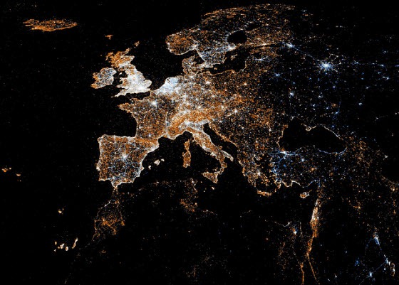
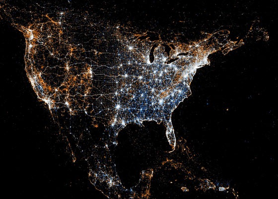
At first glance, the image below looks like a satellite image of Europe at night. Actually, it is a map that reveals how active Europeans are on social networking sites Twitter and Flickr. Created by Eric Fischer, the map combines data from geotagged photos from Flickr and geotagged posts on the micro-messaging network Twitter.

The red dots represent Flickr pictures while the blue dots are tweets. The white dots locations that have been posted to both. Mr Fischer focuses on the continents of Europe and North America, where computer and internet usage is most prolific, making detailed maps of big cities, including New York, Barcelona and Tokyo – as well as the entire globe.

Mr Fischer revealed that it takes 40 minutes to set up file data and 3 minutes to produce the image.
He added that the program runs through the photos/tweets in chronological order, plotting the earliest ones the most brightly and stepping the brightness down for points that don't show up for the first time until later on.
Points are also allowed to diffuse by a few pixels when there is an additional record for a point that is already plotted, with the brightness falling off exponentially as the point that is actually plotted gets further from its intended location.
Each pixel is the somewhat weird area of 2.25 square miles because a smaller area made the whole-world image too big for Flickr to let me post it.
A photographer by profession, Eric Fischer can do magic with data like he does with his camera. Previously, he took geographical data from Flickr and Picasa and created stunning maps of the places that pictures are taken in fifty cities worldwide. He has also created ethnicity maps of the top 40 US cities using census data, and another map that compares Flickr pictures taken by city locals against those taken by tourists.
Fischer’s latest creation is undoubtedly his best ever. Checkout his Flickr page for the rest of the Twitter/Flickr maps.
[via The Daily Mail]

Comments
Post a Comment