New Chrome Experiment Allows Users to Explore 100,000 Stars

Google’s latest Chrome Experiment is an amazing visualization of 100,000 stars in the vicinity of the solar system. The 3-dimensional map actually plots a hundred thousand stars that you can explore by zooming in and out and flying around the galaxy. Zooming in reveals the names of the most prominent stars close to our sun, and if you click on the star's name, Google provides an excerpt about the star (pulled from Wikipedia) as well as a digital rendition of what it looks like.
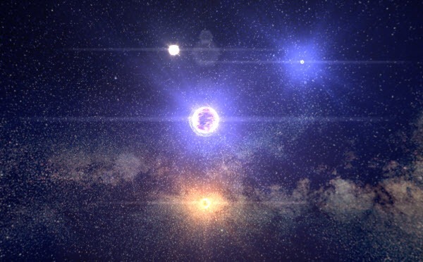
star_system

Zooming in further shows the relative location of the Oort cloud, the planetary orbits, and finally the Sun. Zooming out gives you some context for where we are in the Milky Way. You can also click the tour button in the upper left for a quick trip to some of the coolest perspectives in the galaxy.

The map was created by the Google Data Team, using imagery and data from several sources including NASA and the European Space Agency (ESA). This was finally rendered on screen using WebGL, CSS3D, and Web Audio. Music was provided by Sam Hulick, who composed music for the video game "Mass Effect".

Chrome Experiments is an initiative by Google that showcases creative web programing to demonstrate what’s possible when combining the latest web technologies with a little code and imagination. All experiments are built with the latest open technologies, including HTML5, Canvas, SVG, and WebGL. These experiments are made and submitted by talented artists and programmers from around the world. There are currently over 500 Chrome Experiments on the website.

Comments

Popular posts from this blog

How to Record CPU and Memory Usage Over Time in Windows?

Whenever the computer is lagging or some application is taking too long to respond, we usually fire up task manager and look under the Performance tab or under Processes to check on processor utilization or the amount of free memory available. The task manager is ideal for real-time analysis of CPU and memory utilization. It even displays a short history of CPU utilization in the form of a graph. You get a small time-window, about 30 seconds or so, depending on how large the viewing area is.

How to Schedule Changes to Your Facebook Page Cover Photo

Facebook’s current layout, the so called Timeline, features a prominent, large cover photo that some people are using in a lot of different creative ways. Timeline is also available for Facebook Pages that people can use to promote their website or business or event. Although you can change the cover photo as often as you like, it’s meant to be static – something which you design and leave it for at least a few weeks or months like a redesigned website. However, there are times when you may want to change the cover photo frequently and periodically to match event dates or some special promotion that you are running or plan to run. So, here is how you can do that.

Diagram 101: Different Types of Diagrams and When To Use Them

Diagrams are a great way to visualize information and convey meaning. The problem is that there’s too many different types of diagrams, so it can be hard to know which ones you should use in any given situation. To help you out, we’ve created this diagram that lays out the 7 most common types of diagrams and when they’re best used: