
Diagrams are a great way to visualize information and convey meaning. The problem is that there’s too many different types of diagrams, so it can be hard to know which ones you should use in any given situation.
To help you out, we’ve created this diagram that lays out the 7 most common types of diagrams and when they’re best used:
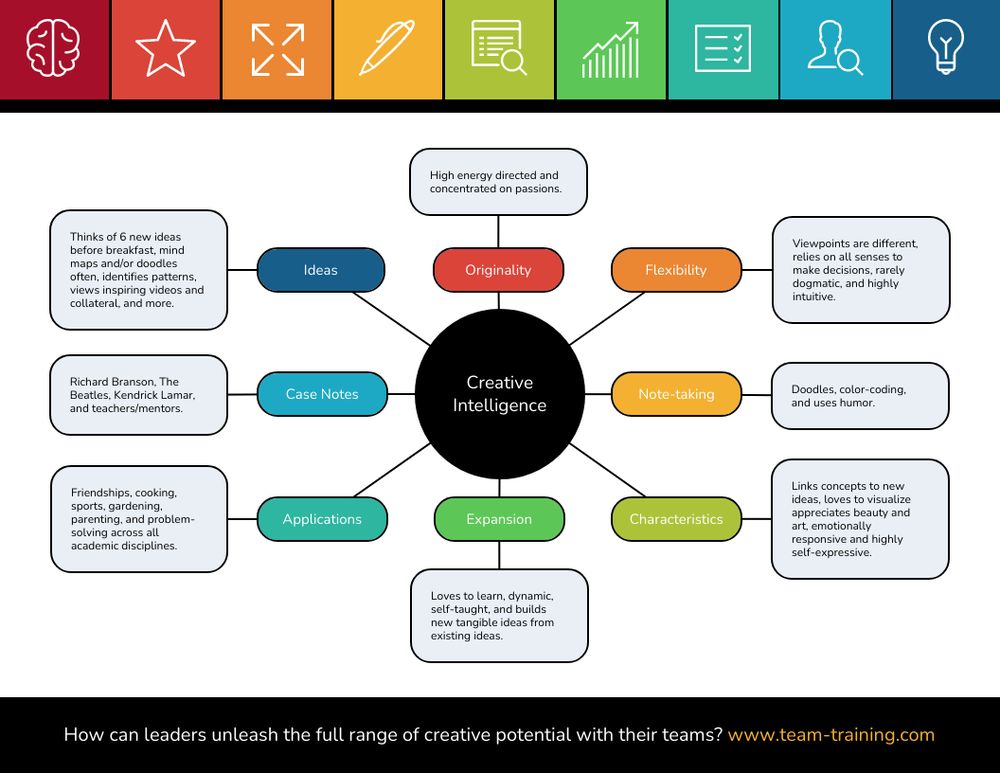
1. Mind Map
A mind map is a fantastic way to brainstorm new ideas, projects or ways of looking at old information. It’s also helpful for planning lessons and other tasks that need to be broken down into steps. We recommend using one whenever you’re confronted with something complex.
2. Flowchart
A flowchart is perhaps the most common type of diagram. It’s perfect for communicating the steps involved in a process (or “flow”) and is particularly popular in scientific diagrams.
3. Concept Map
A concept map is like a mind map with an added emphasis on relationships between different ideas or categories, rather than simply listing them out. This makes it great for making sense of complicated subjects and finding connections between different pieces of information.
4. Flow Network
A flow network diagram is a type of flowchart designed to show how resources (goods, money and other things) move through the different parts of an organization or system. If you’re planning on doing business or studying a topic like economics, it’s well worth learning how to make one of these.
5. Venn Diagram
A Venn diagram (or “set diagram”) is a great way to show how two or more separate things are linked together in some way, like the relationships between countries, political parties or brands and their consumers. They’re also useful for explaining situations where two groups have some things in common, but not everything.
6. Network Diagram
A network diagram shows the relationships between different components (or “nodes”) of a system or organization. They’re often used to show how information is passed around in computer networks and telephone exchanges, but can also be applied to people and other things with interconnected parts.
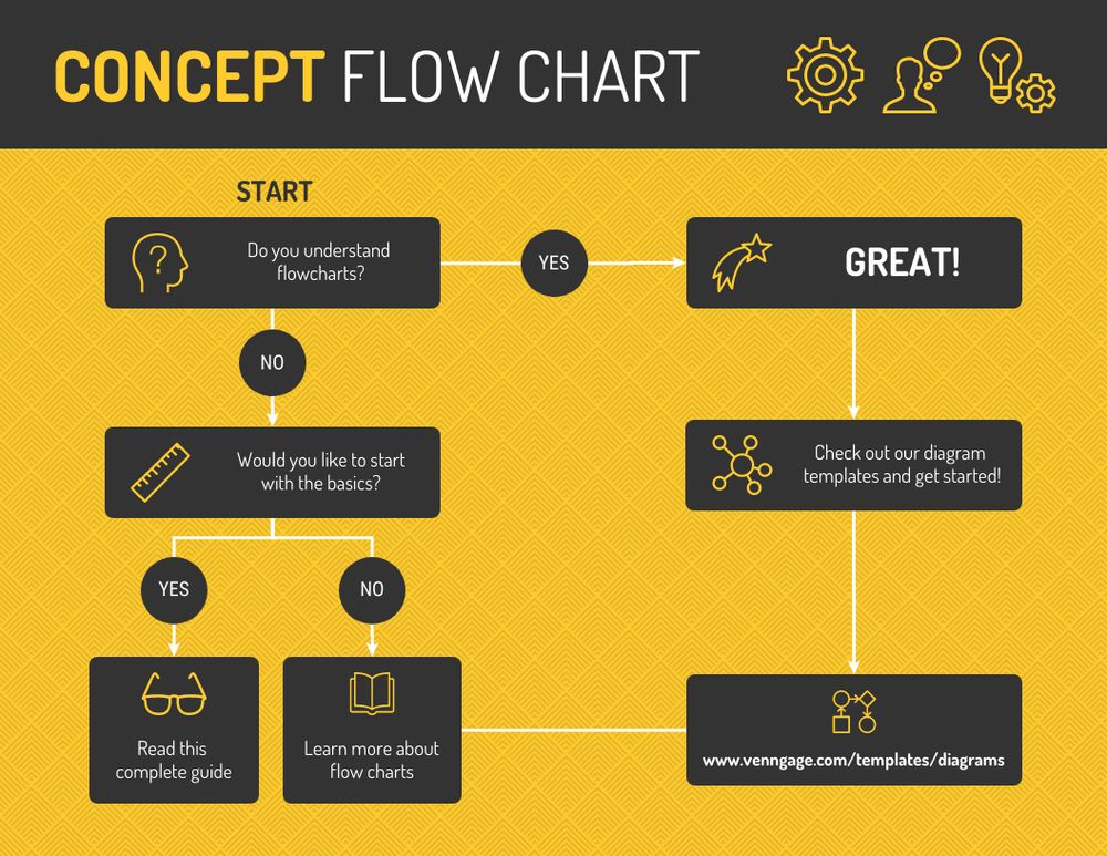
7. Flowchart with Pictures
Out of all the different types of diagrams, this one is probably the best for explaining complex processes. It combines the simple flowchart style (like a flow network) with pictures that help you see what’s happening at each step in the process, like this:
Tips on How To Make Diagrams
To make sure your diagrams are as effective as possible, it’s important to follow a few simple rules when drawing them out.
1. Make Them Simple.
A good diagram should be easy to understand, even if you’ve never seen it before; that means that all the lines in the diagram should be clear and straightforward, there shouldn’t be any unnecessary circles or boxes and the text should be easy to read.
2. Make Them Big.
Like we discussed in our article on How To Draw Charts And Graphs, if you’re drawing diagrams for print media (like reports), it’s important that they’re big enough to see properly when they’re shrunk down. Since most diagrams end up on the Internet, you should remember to use a readable typeface and size it so that all your points are clear when viewed at full-screen.
3. Make Them Colorful Remember.
The point of diagrams is to make information easy to understand, which means they need to be colorful and engaging! You can easily change the colors in most tools (like Microsoft Office or Google Docs) and can always use symbols or icons to differentiate between different parts of your diagram.
4. Use the Right Typeface.
There’s no one perfect typeface for diagrams, but you should choose one that is simple and easy to read, especially if you’re going to be printing them out. If not, then they should be clear and space them nicely so that they don’t overlap or obscure any of your points. A typeface with serifs (like Palatino, Garamond or Times ) is usually a good choice.
5. Put Text at the Top.
You put text on images to explain what’s happening in the picture, but you should usually put the text at the top of a diagram to ensure it’s easy to read. Since most diagrams aren’t intended for print, you can use screenshots from presentations or websites as well as your own drawings, as long as they’re relevant and convey your message clearly.
6. Structure Your Diagrams.
Like we said before, flowcharts and network diagrams (and many others) work best when they’re structured like a flow chart, with nodes coming out of one another. This makes it clear how your information is progressing from point to point.
The last thing to note about these diagrams is that you can use them in combination. For example, a mind map might incorporate a network diagram to show how different pieces of information and themes (like “people” and “places”) connect together.
7. Use Venngage.
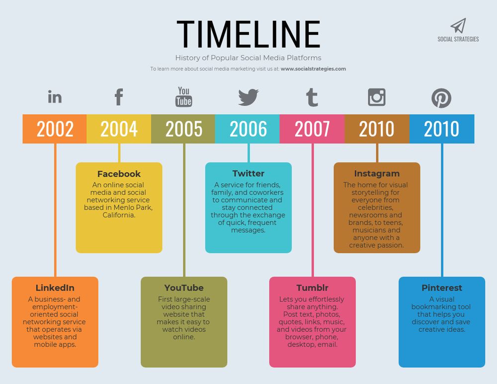
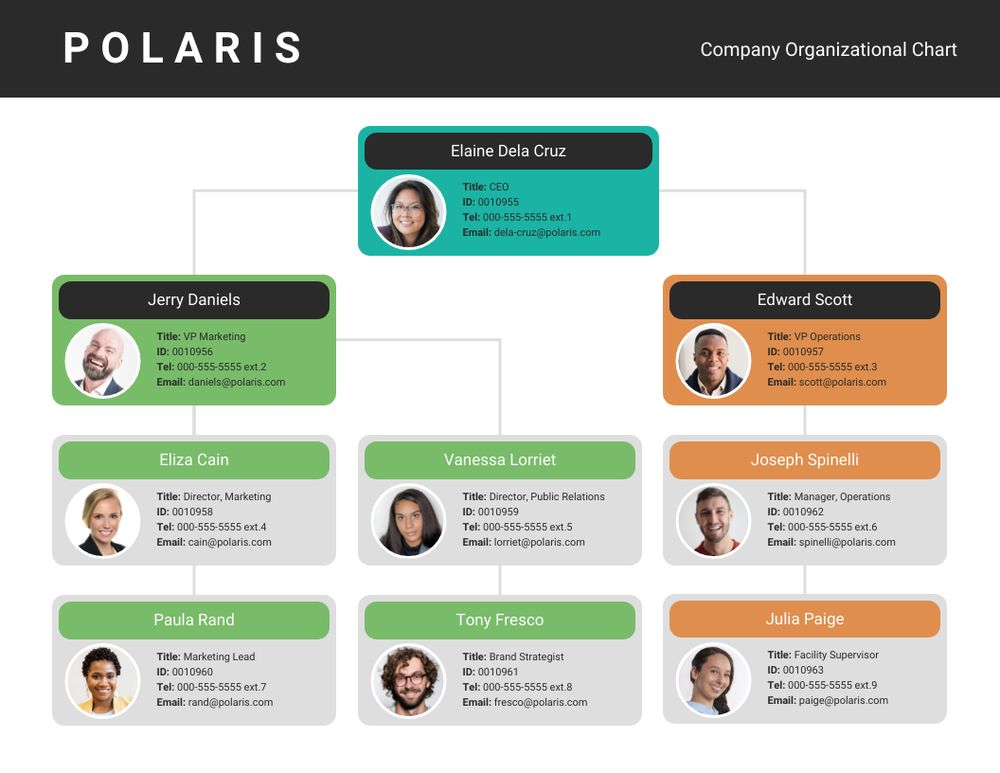
Venngage is an online diagram maker that provides a wide range of creative diagram templates for everyone to use. All you need to do is create a free account, browse through their templates, choose the one you think would best fit your data, customize the design to your liking, input your information, double-check everything, and download. To give you an idea, here are some diagram examples from their website.

Diagrams can be very frustrating sometimes, but with the help of these tips, knowledge, and Venngage, nothing is impossible. Begin your diagram journey and start making your very own diagram today!
Comments
Post a Comment